
Project Background
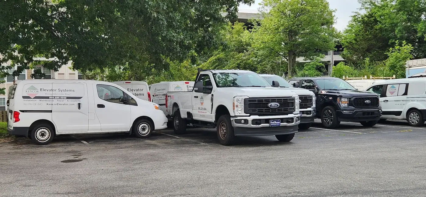
- Kencor had just bought some new vehicles and wanted them to match the vehicle wrap already on the rest of their fleet. They also wanted a local team they could count on. That first project turned into a lasting partnership, and we’re still working together today.
- Kencor is a family-owned and operated business, and you can feel that the moment you work with them. Their team installs, maintains, repairs, modernizes, and inspects elevators, escalators, dumbwaiters, and accessibility lifts. They’re headquartered right here in West Chester and serve customers up and down the East Coast.
- Because their vehicles are always on the road, each one works as a moving billboard for the brand. That’s why the graphics matter so much. Every time Kencor adds a new vehicle, the lettering has to be done before it hits the road and goes into service. We’re proud to be the team that makes that happen.
Challenge
- The toughest part of branding a whole fleet is keeping everything consistent when the vehicles themselves aren’t. Vans, trucks, and cars all come in different shapes and sizes, and a design that looks great on one can look a little off on another. Without a plan, you end up with a fleet that doesn’t quite match. Or you end up paying to rework the graphics every time a new vehicle rolls in.
- So we built a flexible design system from the start, anchored by one consistent color scheme. Instead of reinventing the layout for each vehicle, we can adapt it to fit any body type. That means every new vehicle looks like it belongs the moment it joins the fleet: clean, professional, and easy to spot on the road.
- Of course, not every job goes by the book. On one project, the rest of the vans were white, but the one we were wrapping was gray. To keep the look seamless, we had to match that gray exactly so we could cover the window without it standing out. It took some extra care, but in the end, that van looked just as sharp and on-brand as the rest of the fleet.
How We Did It
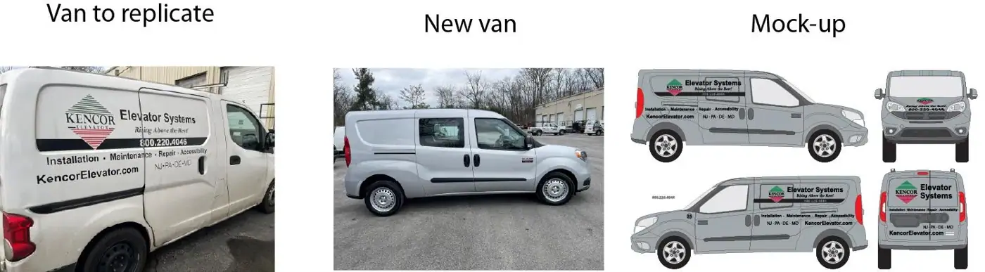
- Our first stop was the job site. We wanted the new van to match the ones we’d already wrapped for Kencor, so we started by photographing the existing graphics up close. We measured the van section by section, because even a small miss can throw off how a design sits on the body. We also wrote down the exact make and model, since that detail matters more than most people realize.
- We brought our Pantone book along, too. That lets us match the logo colors and the van’s gray paint right there, in real light, instead of guessing later from a photo.
- Back at the office, we uploaded all the photos to Kencor’s client folder and got to work on the mockup. We pulled up our vehicle template guide to confirm the van model and double-check our measurements. Then we tracked down the exact fonts used on the original design so the lettering would line up perfectly with the rest of the fleet.
- Gray turned out to be the trickiest part. Shades that look identical in one setting can look totally different in another, so we went back to the site for a second look. Checking the color against the van itself gave us the confidence that our match was as close as it could possibly be.
The Solution
With the design approved, it was time to bring it to life. Every graphic starts on the printer, where we print it onto high-quality vinyl. Then we add a protective laminate over the top. That extra layer is what keeps the graphics looking fresh long after the van leaves our shop. For Kencor’s fleet, we used two premium HP products we trust on every job.
The Products
- HP Permanent Gloss Adhesive Vinyl is the foundation. It has a bright, high-gloss finish that makes colors pop. It holds up well indoors and out. Its high opacity also keeps the design crisp and clean, which mattered a lot on a gray van where we needed full, even coverage.
- HP Clear Gloss Cast Overlaminate is the shield. It protects the graphics from weather, UV rays, and everyday wear, so the colors stay vivid for years instead of fading after a few summers. It also goes on smoothly and comes off cleanly, with no damage to the paint underneath. That’s a big plus when a vehicle gets rebranded or resold down the road.
Finishing
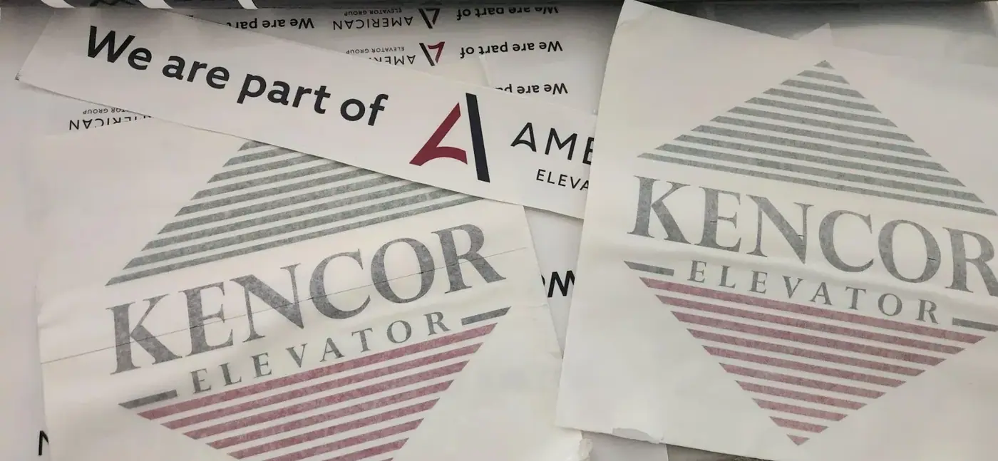
- Once the vinyl was printed and laminated, we moved on to the finishing work. First, our plotter cut each piece with precision, following every curve and letter of the design.
- Next came weeding, where we carefully peeled away the extra vinyl by hand so only the clean graphics remained. Finally, we applied masking tape over the top to hold every element in place and make installation smooth and accurate.
- The result is graphics built to go the distance. They stay sharp, look professional, and keep Kencor’s brand front and center, mile after mile.
Installation
- At last, installation day. This is where all the planning, measuring, and printing finally comes together on the van itself.
- Before a single graphic goes on, we give the van a thorough cleaning. Any dust, wax, or road grime can keep the vinyl from bonding properly, so we take our time here. A clean surface is the secret to a finish that lasts.
- We also clear the space around the van. Installing graphics means a lot of stepping back, moving around, and checking angles from every side. Having room to work freely helps us stay precise and focused.
- Next, we tape each graphic into place, using the proof Kencor approved as our guide. Nothing gets applied until every piece sits exactly where it should. This step gives us one last chance to check the layout on the real vehicle and make sure it matches what the client signed off on.
- While we work, we take careful measurements and note every detail. That way, when Kencor adds another van, we can recreate the setup exactly. There’s one catch, though. It only works if the next van is the same model year, with the same windows, door handles, and body features. Even a small change from one year to the next can shift where a graphic needs to go, so we never assume.
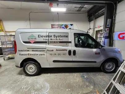
- Once everything is lined up, we apply the graphics. Then comes the part that takes real patience: peeling off the masking. We go slowly and carefully, because one rushed pull can lift a tiny dot or the edge of a letter. Slow and steady wins every time.
- And then we step back and take it all in. A clean, sharp van, perfectly on-brand and ready to join the rest of the fleet. Voilà!
One Fleet, Sixty Vehicles, One Look
Commercial vehicle graphics aren’t limited to a single van. Once the design is set, it can travel across an entire fleet, and that’s exactly what happened with Kencor. Since that first lettering job, we’ve outfitted around sixty of their vehicles, from pickup trucks to larger trucks to cars.
Kencor is growing fast, so new vehicles keep arriving. Each one has a different shape and size, but the brand never changes. We scale the design proportionally to fit every body type, so a pickup and a box truck look like they belong together.
Why It Pays Off on the Road
Every Kencor vehicle works as a mobile billboard. Whether it’s parked outside a job site or sitting in traffic, it puts the company’s name in front of new people. That steady visibility brings in more calls, more inquiries, and more business.
Why Being Local Matters
Being close by is one of the biggest advantages we offer. When Kencor gets a new vehicle, they don’t have to drive it across the region or take it out of service for long. We go to their site and do the lettering right there. It’s one less thing on their plate and one more vehicle ready to work sooner.